This interactive visualization by pitchinteractive details the drone strike deaths in Pakistan based on data from The Bureau of Investigative Journalism.


This interactive visualization by pitchinteractive details the drone strike deaths in Pakistan based on data from The Bureau of Investigative Journalism.
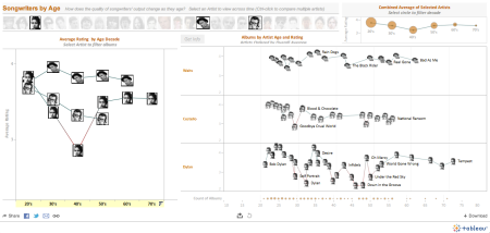
This Tableau visualization plots the age of songwriters vs the average rating of their songs.
I cannot see any obvious conclusions from the viz, but the data is interesting, and the display is pretty cool.
Built using tools from tableausoftware.com.
– via flowingdata.com
